

About the project
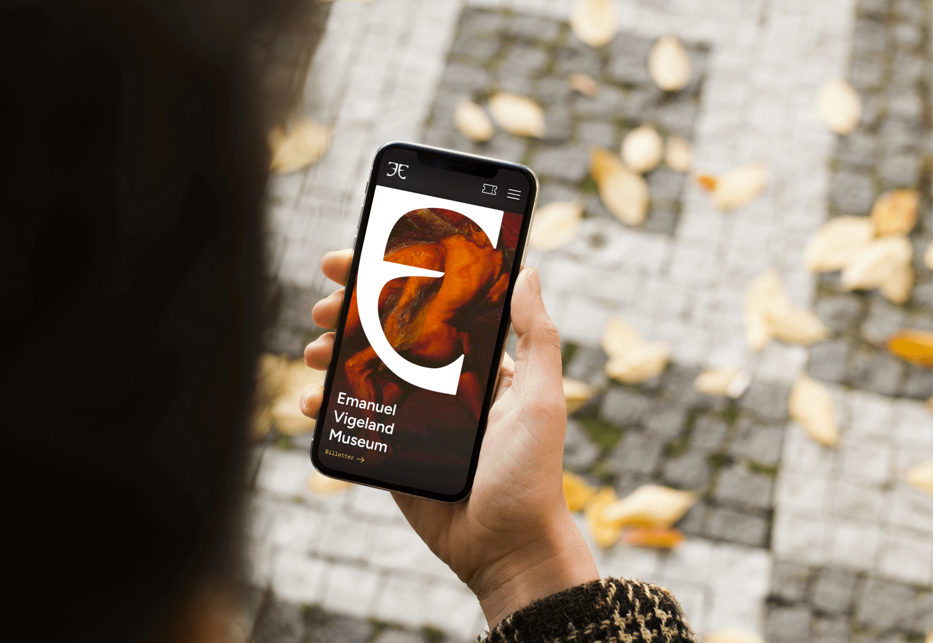
The goal of this project was to redesign the Emanuel Vigeland Museum website based on user insights from the current site, with the aim of improving usability, navigation, and the overall user experience. The redesign focused on better communicating the museum's three main areas: visitor information and ticketing, concert programming, and the museum's art collection.
This was a group project in the course Design Systems and Universal Design (IDG2201). The process followed a user-centred approach, beginning with a UX evaluation of the existing website, followed by user interviews, a SWOT analysis, and a MoSCoW prioritisation to identify what the new solution needed to address. Key issues identified included confusing ticket purchasing, poor typographic hierarchy, and an overall lack of visual structure.
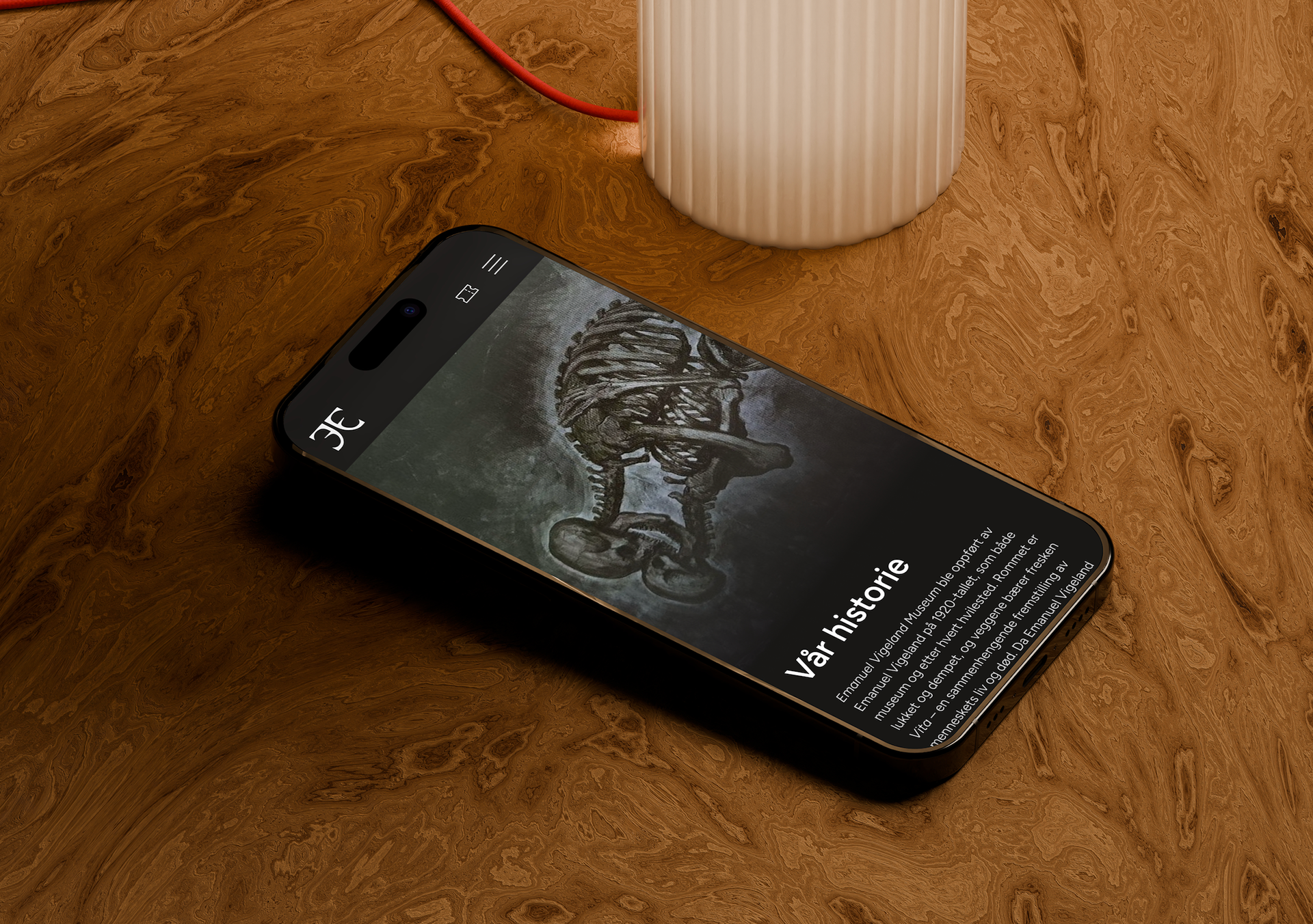
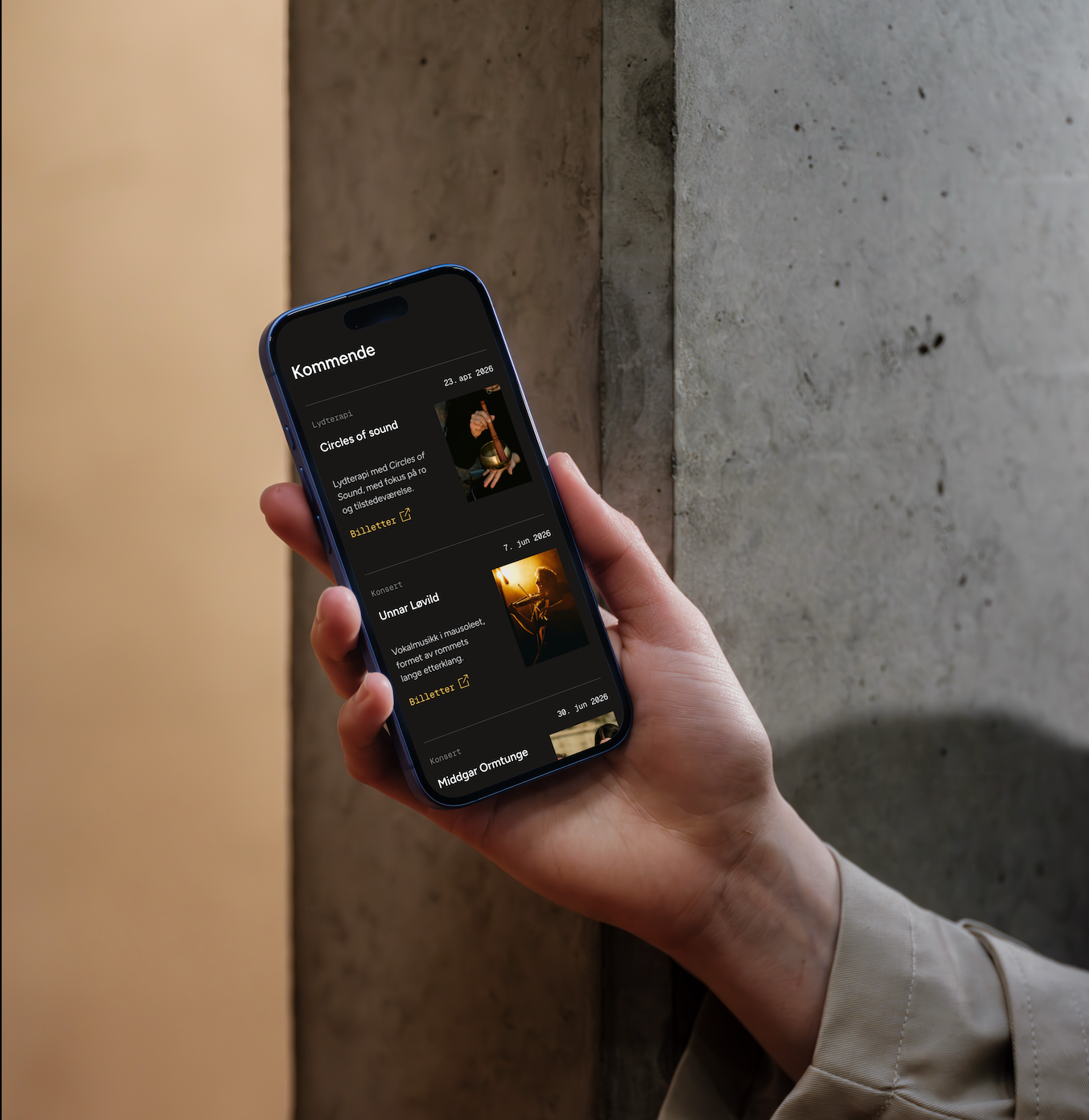
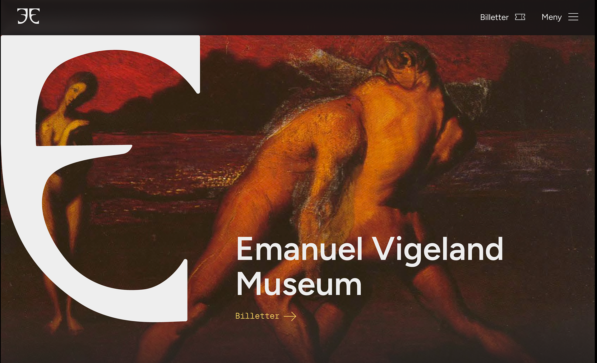
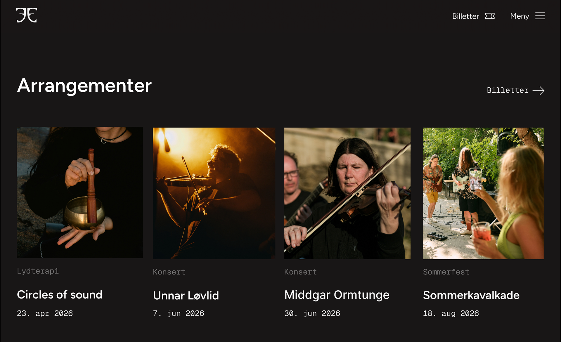
I contributed equally across all phases of the project - from the research and evaluation phase, through prototyping in Figma, to building the design system. The design system establishes a cohesive visual identity for the museum, and was applied consistently across both the mobile and desktop versions of the prototype.
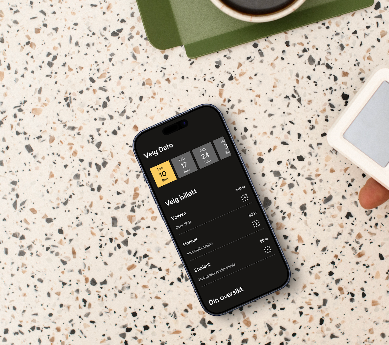
The final prototype is responsive and built with a mobile-first approach, with WCAG AA accessibility as a core requirement. The information architecture was restructured to make ticketing, booking, and event information significantly easier to find.
Process
User Testing of the Existing Website
To understand the weaknesses of the current Emanuel Vigeland Museum website, we conducted user testing with five participants. To get a broad range of perspectives, we tested both students outside of design and interaction design, as well as a professional UX/UI designer. Each participant was given a set of tasks to complete on the existing site while we observed how they navigated and where they struggled.
The testing revealed several key issues: ticket purchasing was confusing and difficult to complete, the typographic hierarchy made it hard to scan and prioritise content, and the overall visual structure left users uncertain about where to find information. These findings gave us a clear foundation to build from, and directly shaped the priorities we set for the redesign.
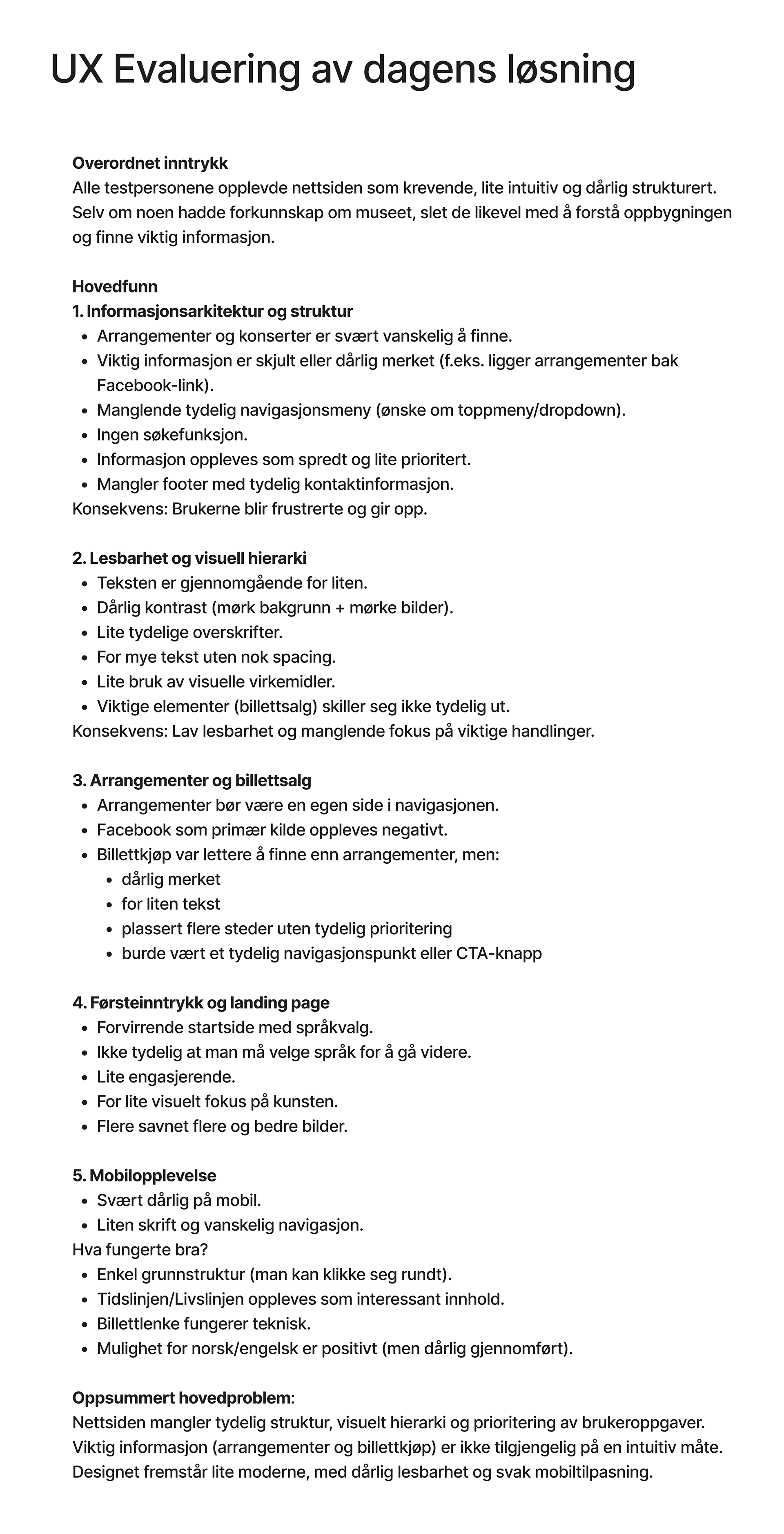
UX Evaluation
Following the user testing, we compiled all findings into a UX evaluation of the existing website. Across all participants, the site was experienced as demanding, unintuitive, and poorly structured. The key issues clustered around five areas: information architecture, readability and visual hierarchy, events and ticketing, first impressions, and mobile experience. Notably, even participants with prior knowledge of the museum struggled to find essential information. The overall conclusion was clear: the site lacked structure, visual hierarchy, and prioritisation of key user tasks.
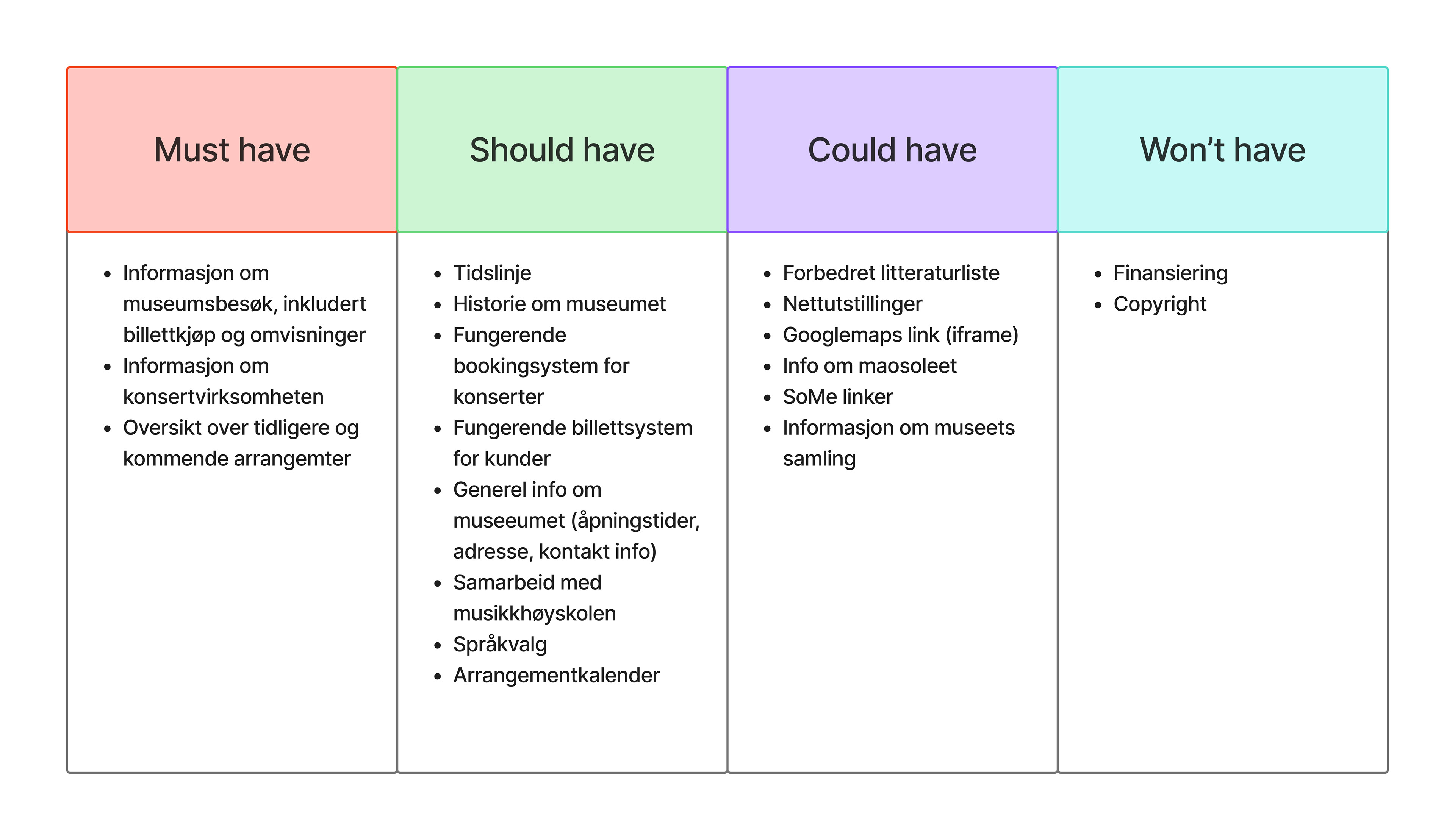
MoSCoW Prioritisation
To translate these findings into a concrete direction for the redesign, we used a MoSCoW analysis to prioritise what the new solution needed to address. Must-have features included visitor information, ticketing, concert programming, and an overview of events. This helped us align as a group on what to focus on and ensured the redesign was grounded in actual user needs rather than assumptions.
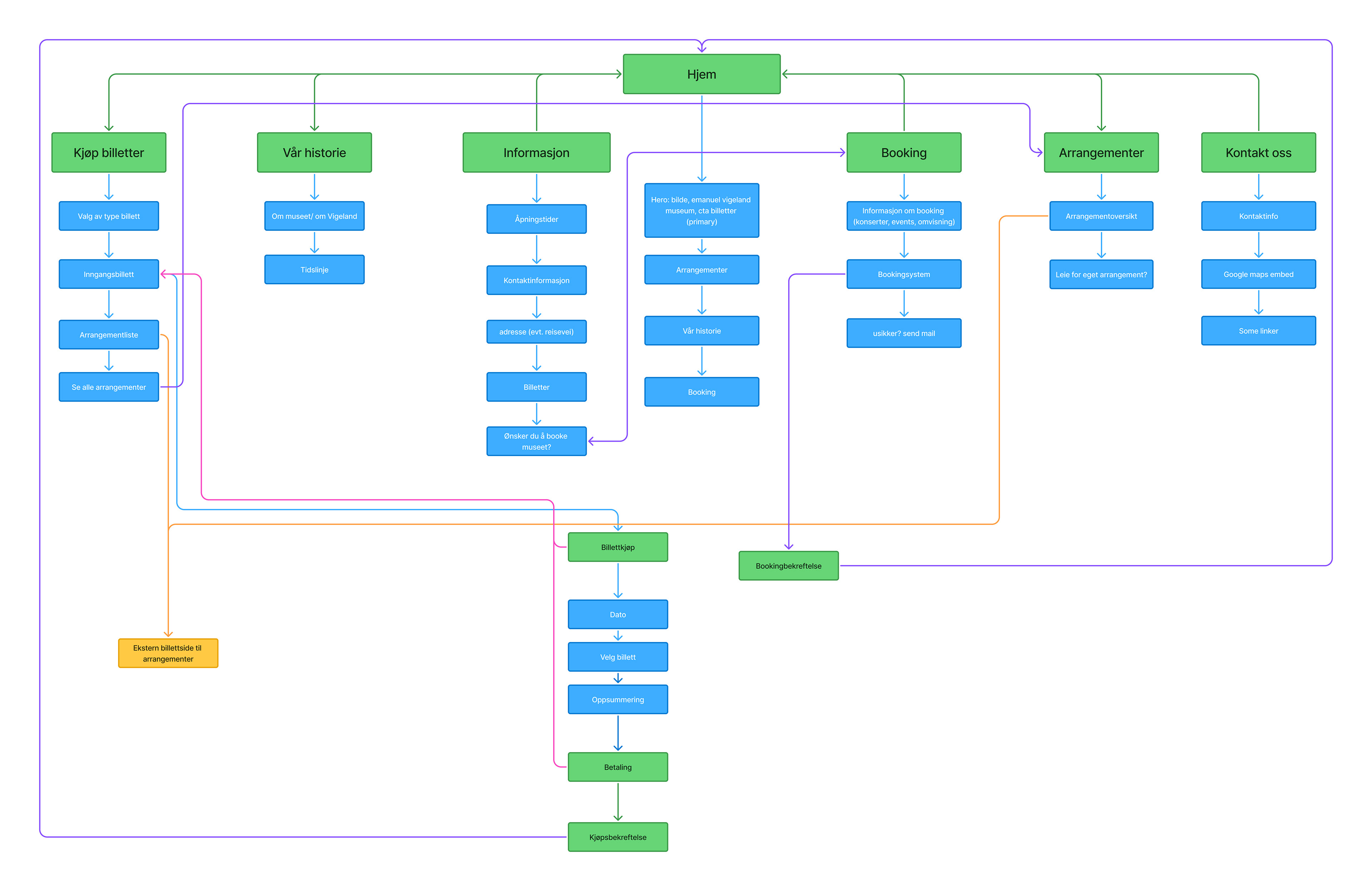
Sitemap
To establish a clear structure for the redesign, we developed a sitemap outlining all the pages and how they connect. The navigation was organised around six main sections: buy tickets, our history, information, booking, events, and contact. Mapping this out ensured we had a shared understanding of the full scope of the site before moving into prototyping, and helped us prioritise the user flows that mattered most, particularly around ticketing and booking.