About the project
The goal of this project was to make the onboarding experience easier for new students at the Department of Design in Gjøvik, by ensuring that time-critical and important information is accessible and easy to find.
This was a semester project in the course Service Design (IDG3002), completed in a group. The task was to design a holistic onboarding service for new students using service design principles, mapping the current service, identifying pain points, and developing a solution that could be tested. Based on our research, we found that students experience information overload in their first weeks, with information scattered across multiple platforms and no clear overview of what is important and when.
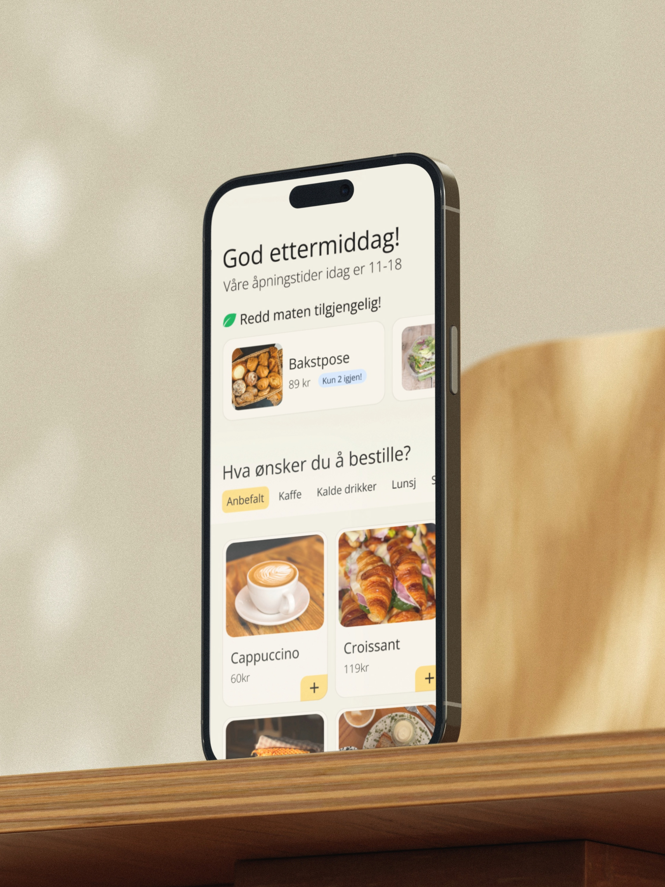
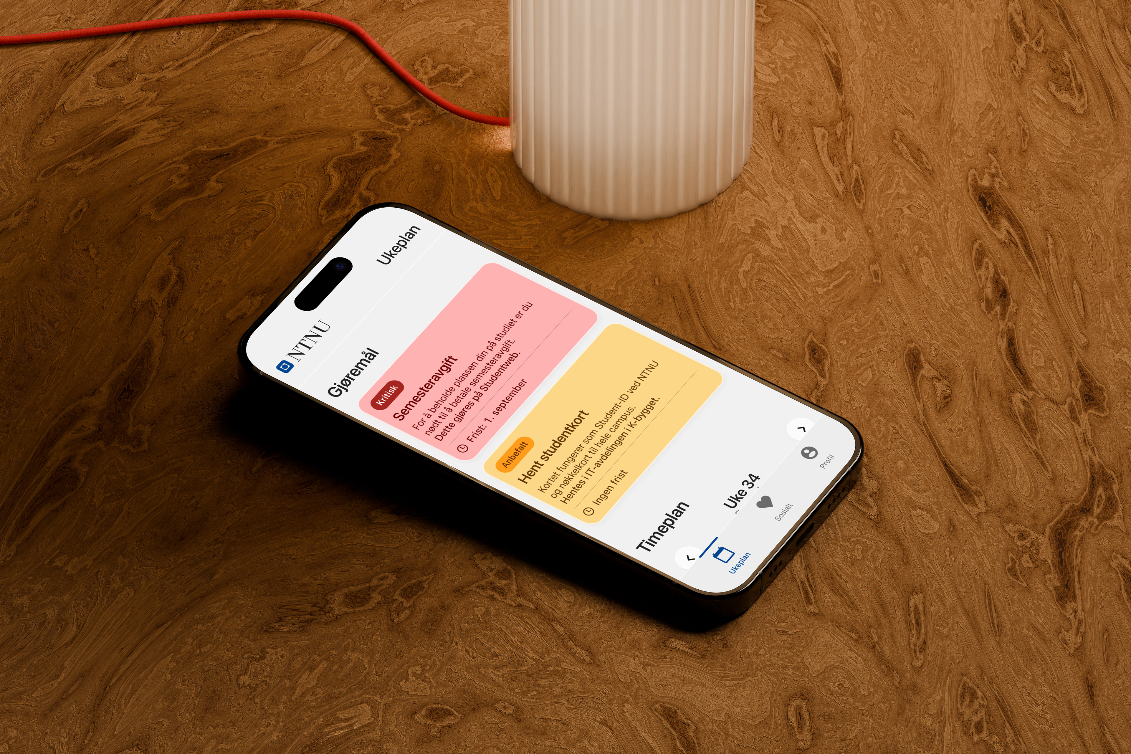
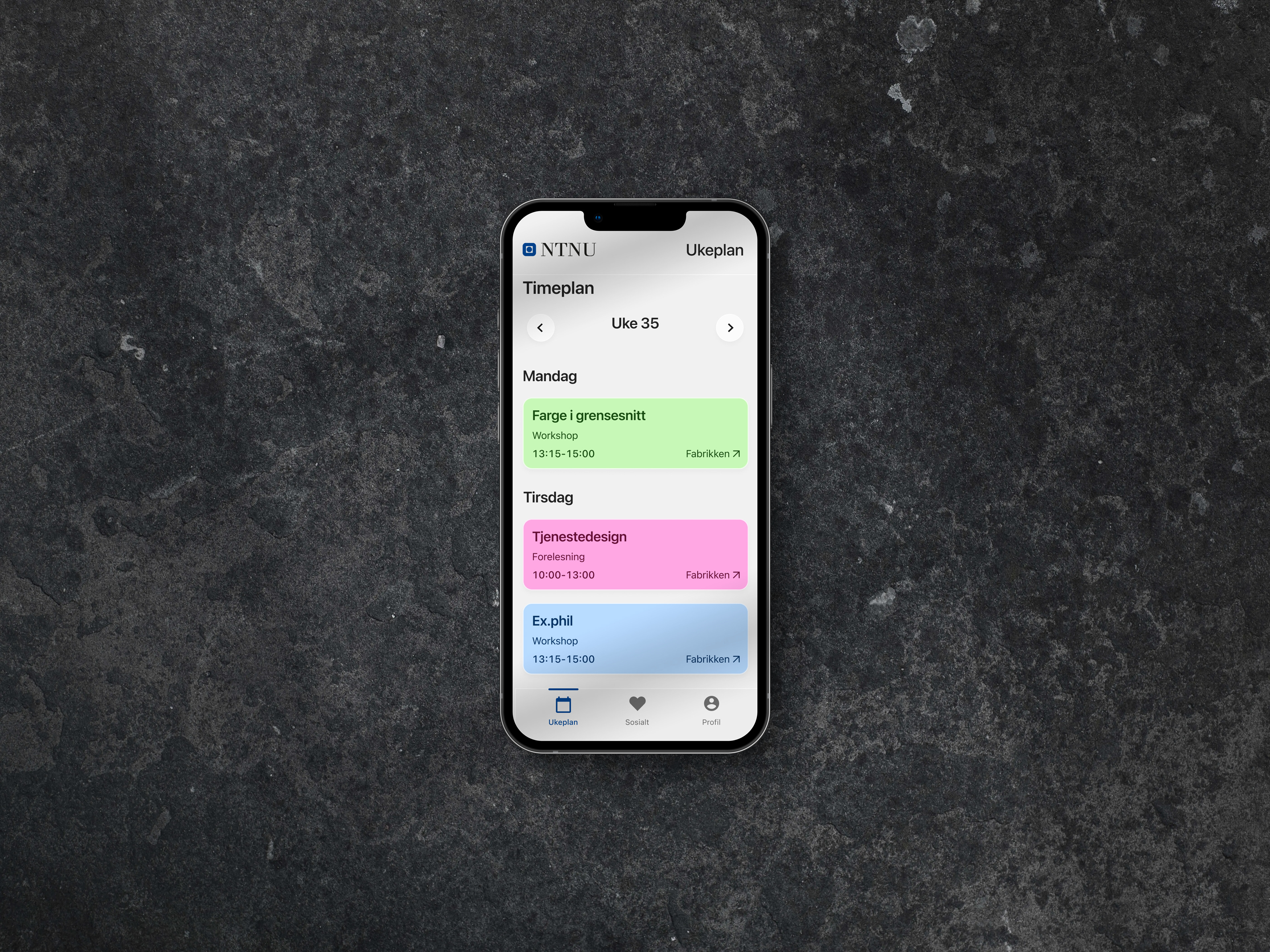
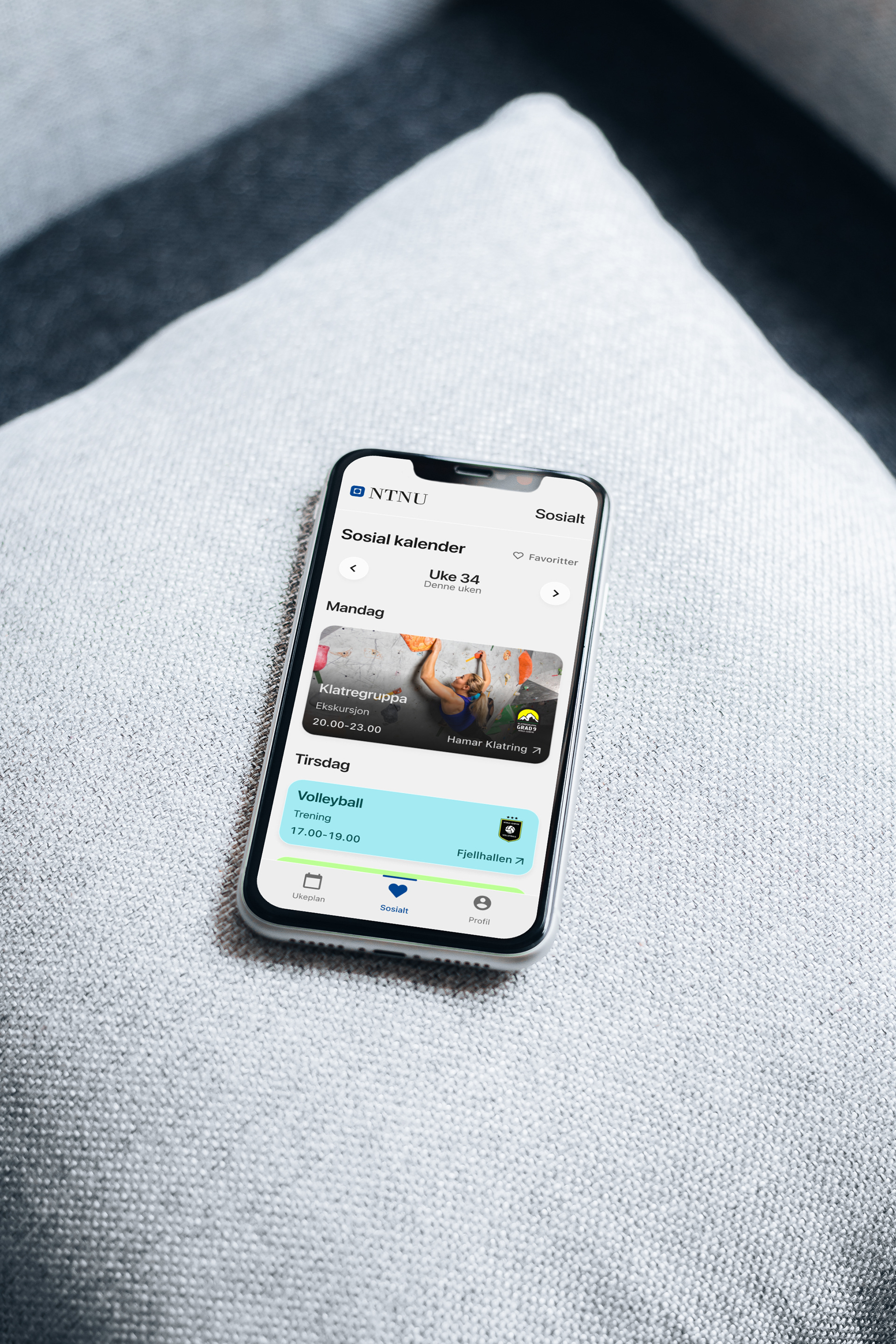
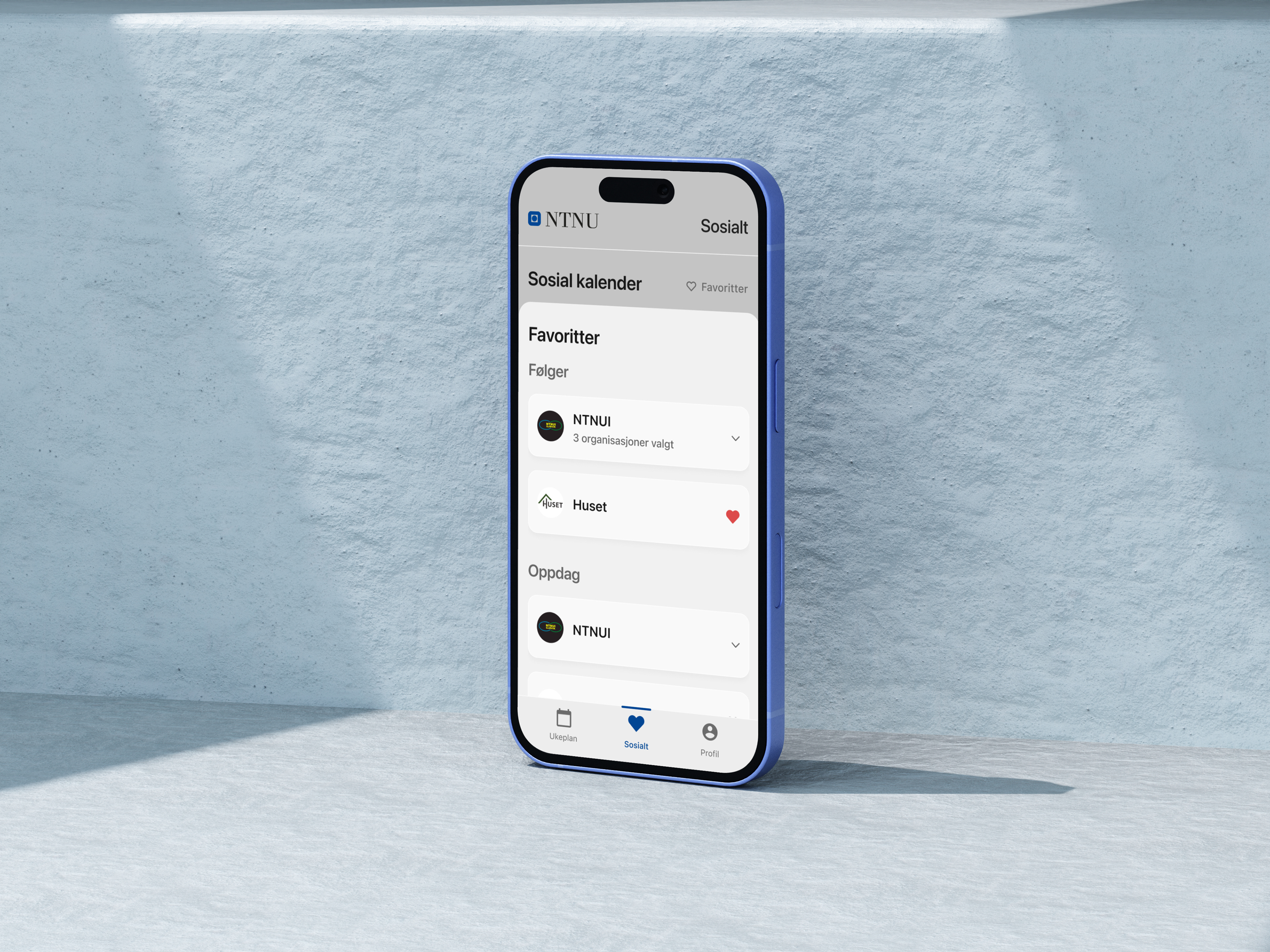
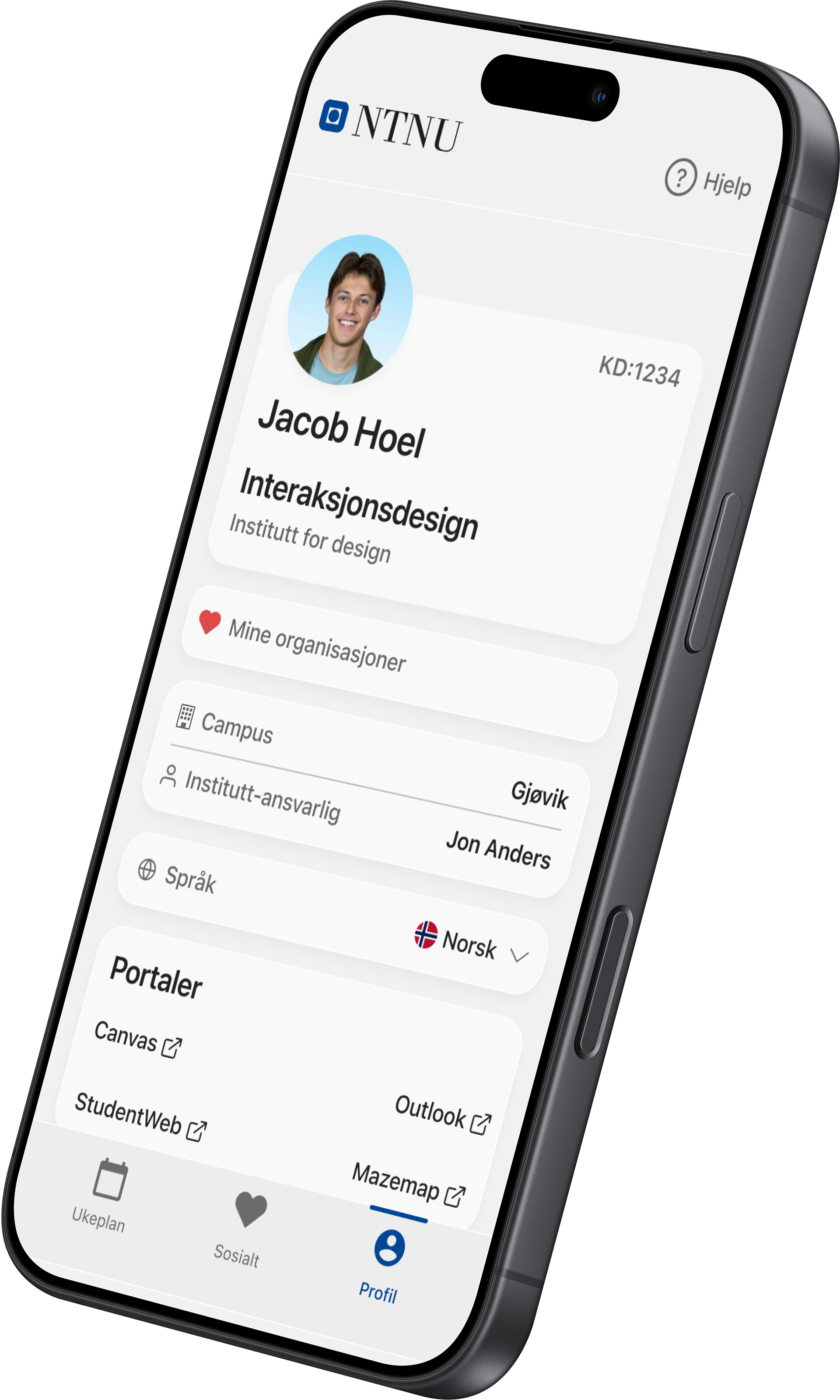
Our solution was a mobile app designed to centralise all essential information for new students in one place. The app integrates data from existing systems such as Canvas, Studentweb, TP/TimePlan, and Mazemap, and includes a personal academic schedule with deadlines and mandatory activities, a social calendar where students can explore and save events from student organisations on campus, and a profile page with key information about the student's programme and study coordinator.
As part of the project, we developed a service blueprint mapping the student journey across four phases, from being admitted to everyday student life, identifying both frontstage and backstage processes, as well as the supporting systems involved.
Process
Interviews
We conducted interviews with first-year students to understand their onboarding experience. A clear theme emerged: information was abundant but disorganised, spread across lectures, Blackboard, and email with no single place to find it all. Students were also uncertain about what they were expected to figure out on their own, and felt that key tools like Blackboard were introduced too late.
We conducted interviews with first-year students to understand their onboarding experience. A clear theme emerged: information was abundant but disorganised, spread across lectures, Blackboard, and email with no single place to find it all. Students were also uncertain about what they were expected to figure out on their own, and felt that key tools like Blackboard were introduced too late.
These insights directly informed our decision to centralise information in one place, and guided which features to prioritise in the solution.
We then developed and refined the concept through several rounds of prototyping and usability testing, using student feedback to shape the information architecture and ensure the app felt relevant from day one.
Workshop
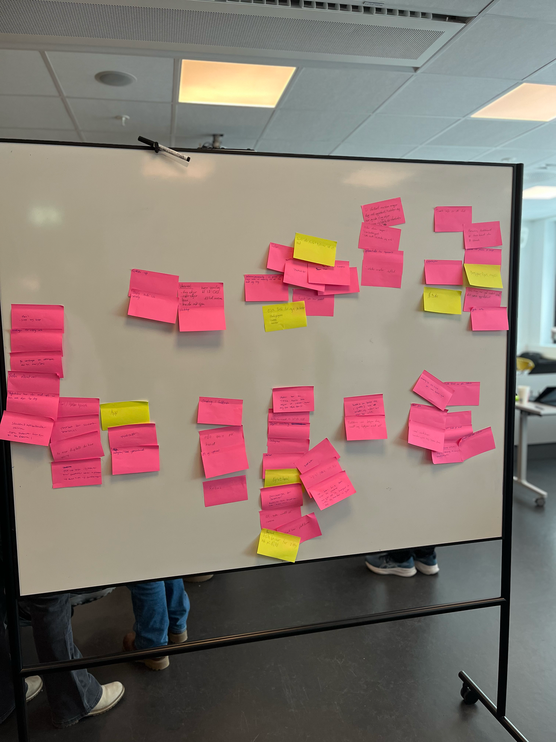
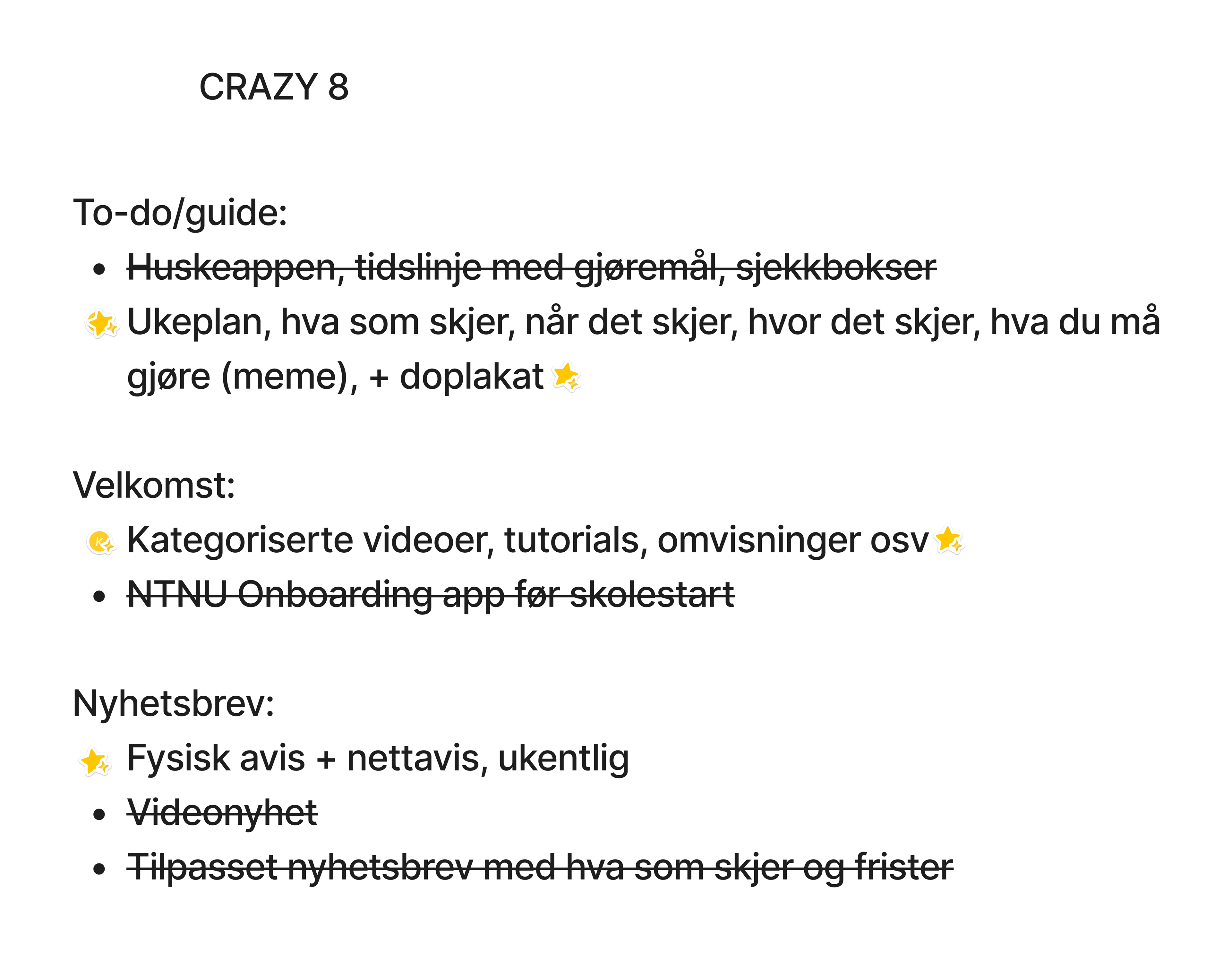
To synthesise our research findings and develop the concept further, we held a workshop with both group members and students. Together we generated around 100 notes covering ideas and potential solutions, which we then organised using octopus clustering, grouping related themes to get a clearer picture of the problem space and identify the most promising directions.
To synthesise our research findings and develop the concept further, we held a workshop with both group members and students. Together we generated around 100 notes covering ideas and potential solutions, which we then organised using octopus clustering, grouping related themes to get a clearer picture of the problem space and identify the most promising directions.
From there, we moved into idea development and prioritisation, evaluating concepts based on user needs and feasibility. Involving students directly in this process ensured that the decisions we made were grounded in real experiences and needs.
Designpilot
We tested the concept through a design pilot with five students, each given a realistic scenario and a set of tasks to complete, such as finding what was happening on a given day or locating information about a student organisation. By observing how they navigated the app with minimal guidance, we collected both qualitative and quantitative data to identify usability issues and refine the solution before finalising the design.
We tested the concept through a design pilot with five students, each given a realistic scenario and a set of tasks to complete, such as finding what was happening on a given day or locating information about a student organisation. By observing how they navigated the app with minimal guidance, we collected both qualitative and quantitative data to identify usability issues and refine the solution before finalising the design.
Service blueprint
Based on these insights, we developed a service blueprint mapping the student journey across four phases, from being admitted to everyday student life. It visualised touchpoints, emotions, and supporting systems at each stage, and helped us identify where the experience broke down and where a solution could have the most impact.